Principles of Product Design
Key Principles:
(1) People want to use something to serve a particular purpose. Meet that purpose.
(2) Expectations must marry outcomes. Set the expectations and outcomes, and you’ll have happy users.
(A) Know your users
If your users are unsophisticated, then your product must be simple and intuitive. If they have to read a manual to use your product, consider redesigning it.
If you are designing products for programmers, who have some (but not much) willingness to learn and read, then designing a complicated product, e.g. like git, might be an option. Users are expected to read the manual. Accordingly, you can get away with some complications.
Pick your users, and design things FOR those users.
Examples of where things could be avoided:
This is best illustrated by examples of complications. In the AWS Suite of products, the naming used can be confusing:
- What is the difference between AWS Secrets Manager and AWS Parameter Store (Systems Manager)?
- Or what is the difference between different storage options: AWS EFS, EBS and S3?
The answers are not immediately obvious, even after a little bit of reading.
(B) Minimize the crap
This can come in many forms: marketing, or unecessary information on the screen. Why should we minimise this? Because it has a cost: time. It hinders users from what they want to do, quickly.
If you can minimise text or clutter, then do so. You will save thousands of hours/minutes given your user base.
(i) Minimize Crap: Unecessary Verbiage
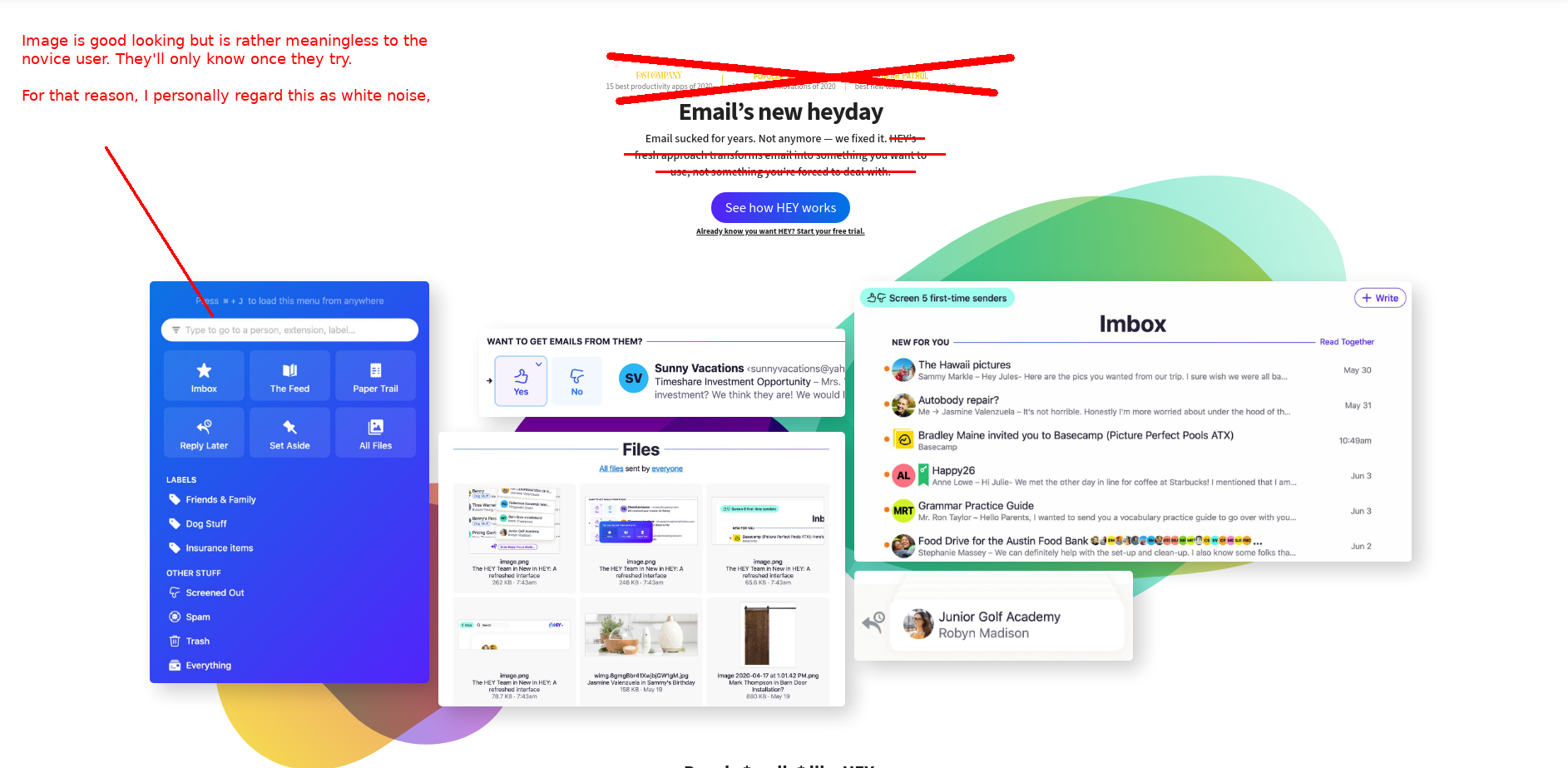
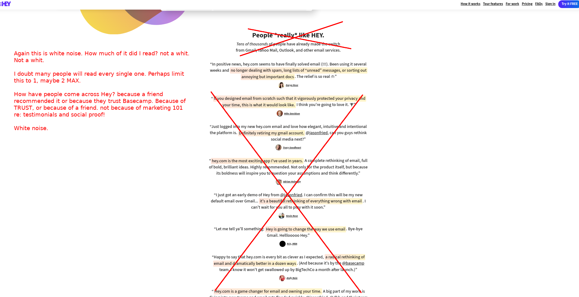
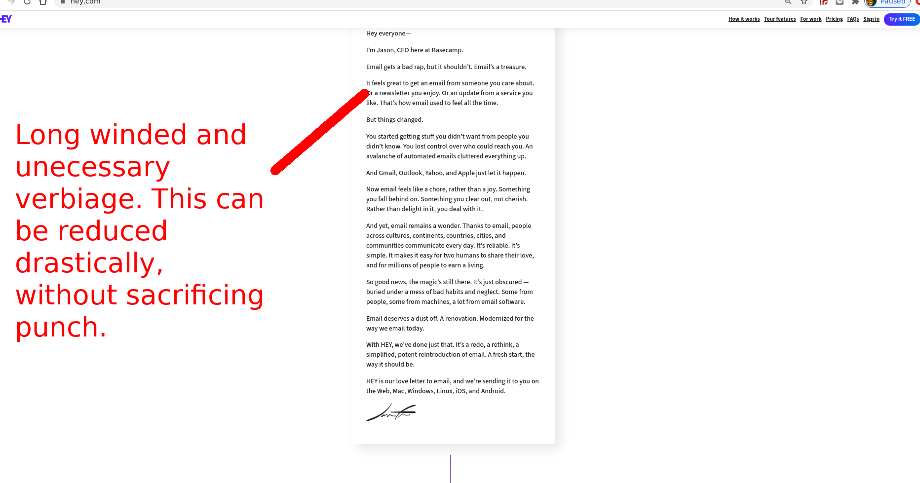
Example 1: Basecamp’s Hey Marketing Page
Preface: The Basecamp guys have done amazing things (superb product design, first-class marketing (via teaching and building audiences)) but their marketing page sucks: check it out: Hey!. Who wants to read a 100 testimonials and be greeted with a wall of text? I don’t want to be seen as bagging folks who’ve done more in their sleep then I’ve done in a lifetime awake: Basecamp have been in business for a long time, and they deserve all the kudos that comes with designing great products.
Why do people come to Basecamp? Seeing they have no direct marketing (i.e. ads on Youtube like Monday.com), they probably come for two reasons: (i) because a friend recommended it, or (ii) they TRUST Basecamp. (Trust is the key to all things, lies at the very foundation of all relationships, business or otherwise).
The products market themselves without the reams of testimonials and social proof. They would probably be just as successful without the marketing page.
Here’s my take on it:
Even the best in the world can improve.
Example 2:
This is terribly embarrasing, and an example of supreme mediocrity - an app that I without some clear design focus:
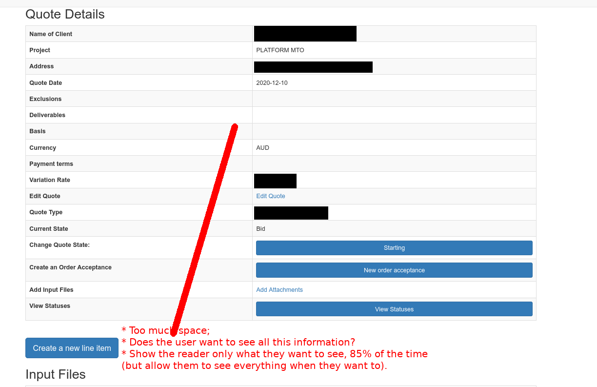
Points to note:
- Much space is given to items that users don’t particularly want to see. Does the reader really want to see the address of a particular client? Or the currency denomination? Minimise the verbiage because anything additional is a cognitive burden to the user.
(ii) Minimize Crap: Unecessary Features - Feature Envy
How much of a product do you actually use? Most people use a product for a few key things. The rest is superfluous. Why invest huge chunks of your time on something that nobody is going to use? Nothing is more demorialising if you are a product creator.
Example 1:
The ls command has a million flags. But I tend to resort to only a few flags. I simply don’t really need to, in order to get the job done. The flags may have a useful purpose, but in order to really understand them, I would have to invest a considerable amount of time to learn those flags. And I don’t see a big pay-off in doing so. I feel that it is the same with software.
(iii) Minimize Crap: Minimise Work for the User
-
Don’t make it difficult for your users.
-
Don’t make them scroll, or click an additional button, if it can be avoided. Users prefer simplicity, our job is to indulge them.
(C) Take users on a journey
This is a concept that I wish to explore. The user who first signs up will be very different form a user who’s a 10 year veteran. The user interface should respond accordingly, as their learning experience develops.
New users should see very little on the screen, untill they become accustomed to features/buttons and placements. As they progress, then and only then, should features and buttons be displayed, according to their convenience - if you want to go down that path. But above all, designing a product for simplicity is the key.
(D) Maximise your investment by Focus
Your time is limited. Focus the little time you have on solving the BIG problems for your customer. Focus your time, on saving THEIR time. Any time you save them will be multiplied exponentially across your user base. The better you do this, the quicker it will be for you to get cash in through your door.
(E) Ensure Expectations Meet Outcomes
(i) Expectations meeting outcomes: Minimise opportunity for mistakes
Users will do crazy things. Minimise the opportunity for them to get things wrong by gently guiding their actions. e.g. if your calculator does not accept text inputs, then users must understand this somehow, and easily.
(ii) Expectations meeting outcomes: Adopt existing paradigms
My users are not tech geniuses, but they have certain expectations when using a website, based on using other products .e.g. Google, or Facebook etc. You can use these assumptions and expectations to build your own product. For example, having a “Sign out” link on the right hand side of your page. If you do this, users will already “know” how to use your site because it adopts existing conventions and paradigms.
On the other hand, if you are varying from the existing paradim, then you will need to educate your users on how to use your products, and this involves taking your users on a journey. There are two types of users in this case: those who know what they are doing, and those who do not. Fragment your product to meet the needs of both.